
1. Project Overview & Objectives
EOC ONE (Executive Operations Center ONE) is a unified dashboard designed to provide real-time visibility into the health and performance of consular systems, including passport services, visa clearances, data centers, and microservices. Managing over 10,000 servers and critical applications across global posts, the Bureau of Consular Affairs needed a centralized tool to replace siloed monitoring systems like disparate alerts from ServiceNow, CASDB reports, and manual status checks.
Core Goals
- Deliver at-a-glance enterprise health scores for executives to make rapid decisions
- Integrate stoplight (red/yellow/green) indicators for quick issue identification across components like capacity, APIs, and databases
- Enable proactive ticket management with actions like "Open a Ticket" directly from alerts
- Support drill-down views for specific subsystems (e.g., CASDB, Microservice APIs, FEP-TDIS)
- Incorporate motivational visuals with a "journey" theme to emphasize oversight as an exploratory process
2. Discovery & Research Findings
- Conducted 4 workshops and interviews with CA executives, IT ops teams, and post managers (n=35)
- Key pain points:
- Overwhelmed by fragmented tools: Alerts from ServiceNow, status from OEM/DSR, no single pane of glass
- Delayed responses to outages in global posts (e.g., visa services in Abuja or Jerusalem)
- Lack of visual prioritization: Executives spent hours parsing text logs for critical issues
- Need for mobile-friendly views, but primary use on large monitors in ops centers
3. Key Personas
- CA Executive (e.g., Deputy Assistant Secretary) – Needs high-level health scores and global overviews
- Operations Manager – Focuses on alerts, tickets, and subsystem statuses like FEP-TDIS or CASDB
- Post IT Lead (e.g., in overseas embassies) – Monitors local services like visa clearances and requires quick ticket actions
- CIO/Analyst – Dives into detailed metrics like server uptime (98% UP) or failed backups
4. Design Strategy & Core Concepts
"To Know Now" Metaphor Framed around exploration and oversight, using mountain/hiking imagery to symbolize "climbing" to visibility over complex systems. The login screen sets the tone with a hiker overlooking peaks, reinforcing real-time knowledge as empowerment.
Multi-View Architecture
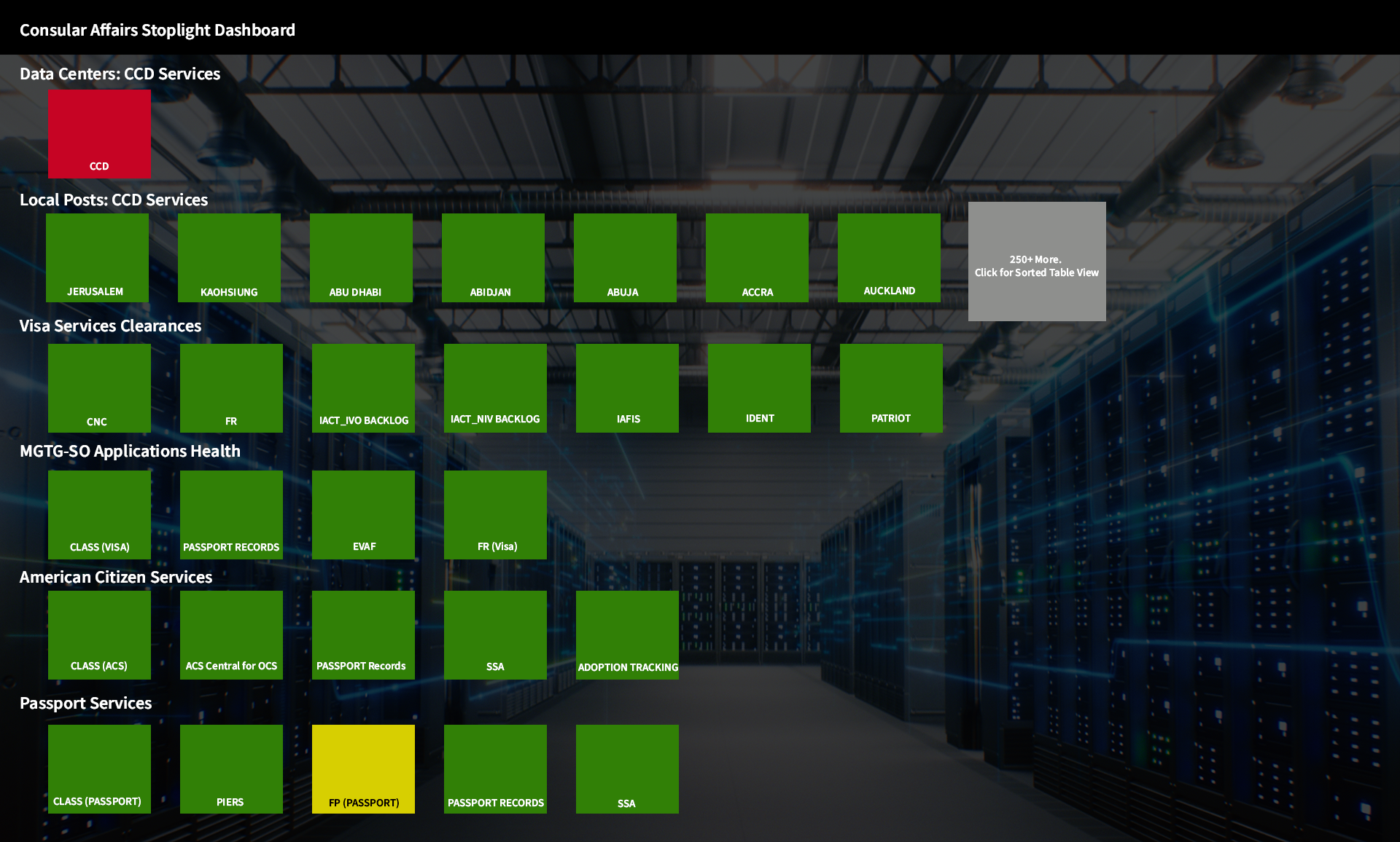
- Stoplight Dashboard: Color-coded blocks for quick scans of data centers, local posts, and services
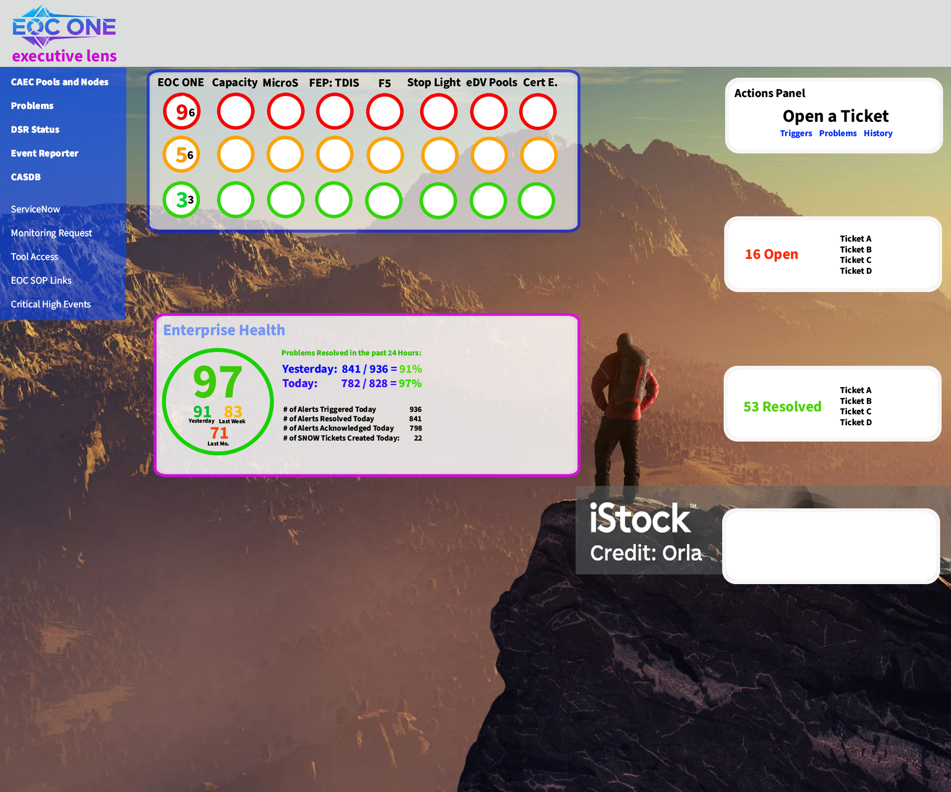
- Executive Lens: Aggregated health with bubbles for components (e.g., 9 red for capacity issues)
- Subsystem Views: Dedicated dashboards for CASDB, Microservice APIs, FEP-TDIS, DSR Status
- Event Reporter: Time-based alerts with today/yesterday/last month breakdowns
Proactive Actions
- Integrated "Actions Panel" for opening tickets, viewing history, and resolving issues inline
- Health scores (e.g., 97) with trends (e.g., +8.4% daily) to highlight improvements or declines
5. Information Architecture & Navigation
- Left sidebar: Core sections like Executive Lens, CAEC Pools and Nodes, Problems, DSR Status, Event Reporter, CASDB, ServiceNow, etc.
- Top banner: Stoplight indicators for key components (Capacity, Micros, FEP:TDIS, F5, etc.)
- Persistent elements: Enterprise Health circle, login/logout, and search for specific alerts
- Drill-down flow: From high-level stoplights → detailed views → action panels
6. Key Screens & Design Decisions
A. Login Screen
- Motivational overlay with hiker and "To Know Now" tagline
- Simple "Log In" button to encourage quick access
- Sets exploratory tone without overwhelming new users
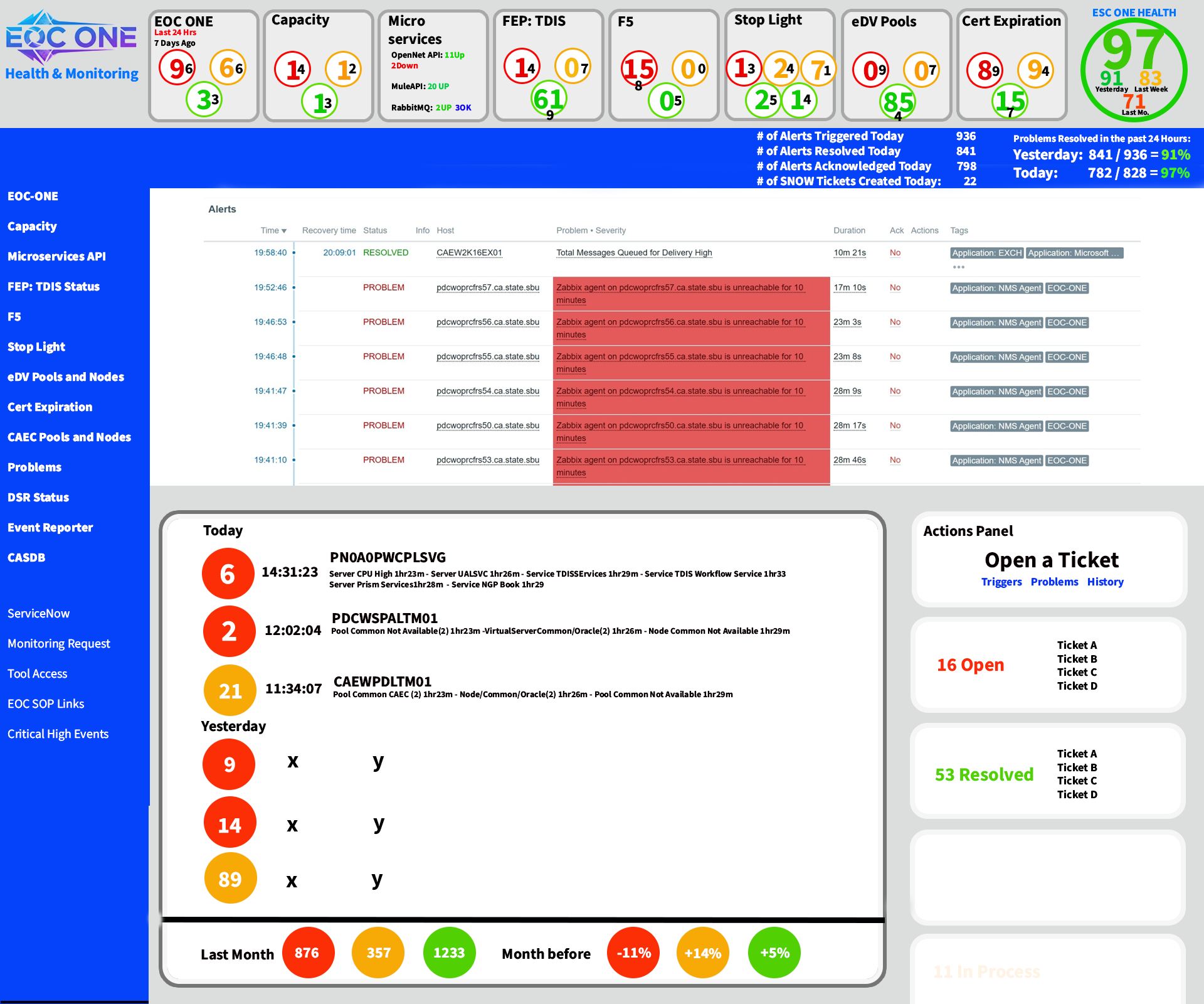
B. Executive Lens (Main Dashboard)
- Hero health score (97) with comparisons (yesterday, last week, month)
- Stoplight bubbles: Red for critical (e.g., 9 issues), yellow for warnings (5), green for healthy (33)
- Alerts table: Sorted by time, with severity highlights (red for PROBLEMS)
- Event Reporter: Numbered circles for today's events (e.g., 6 high-priority), with descriptions and durations
Pre-design wireframe with feedback from 10 stakeholders:
C. Consular Affairs Stoplight Dashboard
- Grid layout with color-coded tiles for data centers (red for CCD), local posts (greens for Jerusalem, Abuja), visa services, etc.
- Interactive: Click tiles for sorted table views or details
- Yellow highlights for at-risk items like FP (PASSPORT)
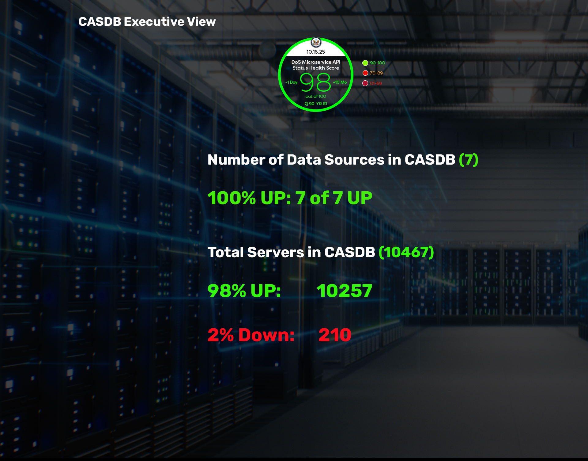
D. Subsystem Views (e.g., CASDB Executive View)
- Circular health gauge (98) with breakdowns: 100% UP for data sources, 98% servers UP
- Lists down servers (210) in red for emphasis
E. Microservice API Dashboard
- List format with UP/Down/Not Found statuses (e.g., 14 UP for OpenNet-API)
- Aggregated score (92) with trends
F. DSR Status
- Detailed metrics: 99% Oracle backups completed, failed jobs in red, lists of down targets
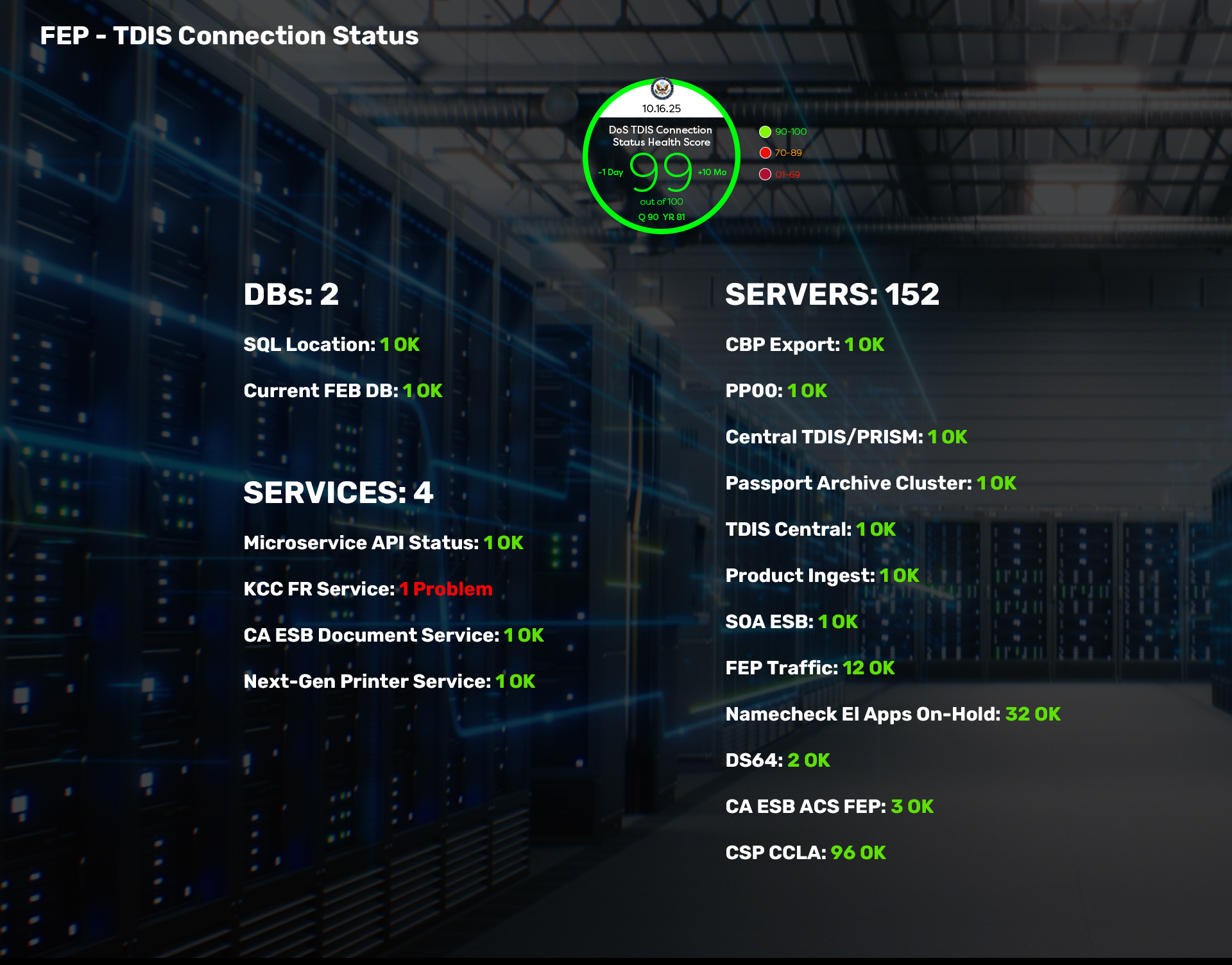
G. FEP-TDIS Connection Status
- Categorized lists: DBs (all OK), Servers (152), Services (mostly OK, 1 problem in red)
7. Visual Design Language
- Color scheme: Blue/purple gradients for backgrounds, green/red/yellow for statuses (State Department compliant)
- Scenic overlays: Mountain vistas with iStock credits for inspirational feel
- Bold, readable typography for metrics; circular gauges for health scores
- Data center imagery in backgrounds to contextualize IT infrastructure
8. Results (as of December 2025)
- Adoption rate: 92% of CA executives use EOC ONE daily (up from 45% with legacy tools)
- Response time to alerts reduced by 65% via integrated ticket actions
- Health score improvements: Average enterprise health rose from 88 to 97 in pilot posts
- User satisfaction: 87% rated the stoplight visuals as "highly effective" in tests
- Global coverage: Monitored 250+ local posts with zero reported visibility gaps
9. Key Takeaways & Iterations Planned (Q1 2026)
- Visual metaphors boosted engagement – users appreciated the "journey" theme for complex monitoring
- Stoplight system was a hit for quick scans; plan to add customizable thresholds
- Mobile optimization underway for field agents
- AI integration for predictive alerts based on trends
- Dark mode variant for 24/7 ops centers
Conclusion EOC ONE reimagined consular operations monitoring from a reactive chore into a proactive, visually empowering experience. By consolidating disparate data into intuitive stoplights, health gauges, and actionable panels, executives can now "know now" – spotting issues at a glance and resolving them swiftly. This dashboard not only enhances efficiency but also aligns with the exploratory spirit of diplomatic technology, ensuring seamless global services.