1. Project Overview & Objectives
The Office of Passport Production (OPR) processes over 20 million passport applications annually across 29 agencies. Leadership needed a single, real-time source of truth to replace fragmented Excel reports and email chains.
Core Goals
- Provide executives with instant visibility into production health, bottlenecks, and trends
- Reduce decision-making latency from days → minutes
- Gamify performance to drive healthy competition between agencies/regions
- Support multiple mental models: geographic, location-based, and time-based analysis
2. Discovery & Research Findings
- 3 rounds of interviews with Directors, Agency Managers, and CIO staff (n=28)
- Current pain points:
- No single dashboard existed – users opened 7–12 reports daily
- Regional directors couldn’t easily compare their agencies
- “High-score” culture existed informally via email → opportunity to formalize with gamification
- Executives wanted both macro trends and the ability to drill into specific agencies
3. Key Personas
- Passport Services Director – needs national overview + high-level trends
- Regional Director – wants to compare 4–6 agencies in their region
- Agency Manager – cares about their single location’s performance vs. peers
- CIO/Analyst – needs raw numbers and custom date range
4. Design Strategy & Core Concepts
“Journey” Metaphor The entire experience is framed around a travel/aeronautical theme (“It’s About the Journey”) — passports enable travel, and applications move through a lifecycle that feels like a journey from submission → adjudication → printing → mailing.
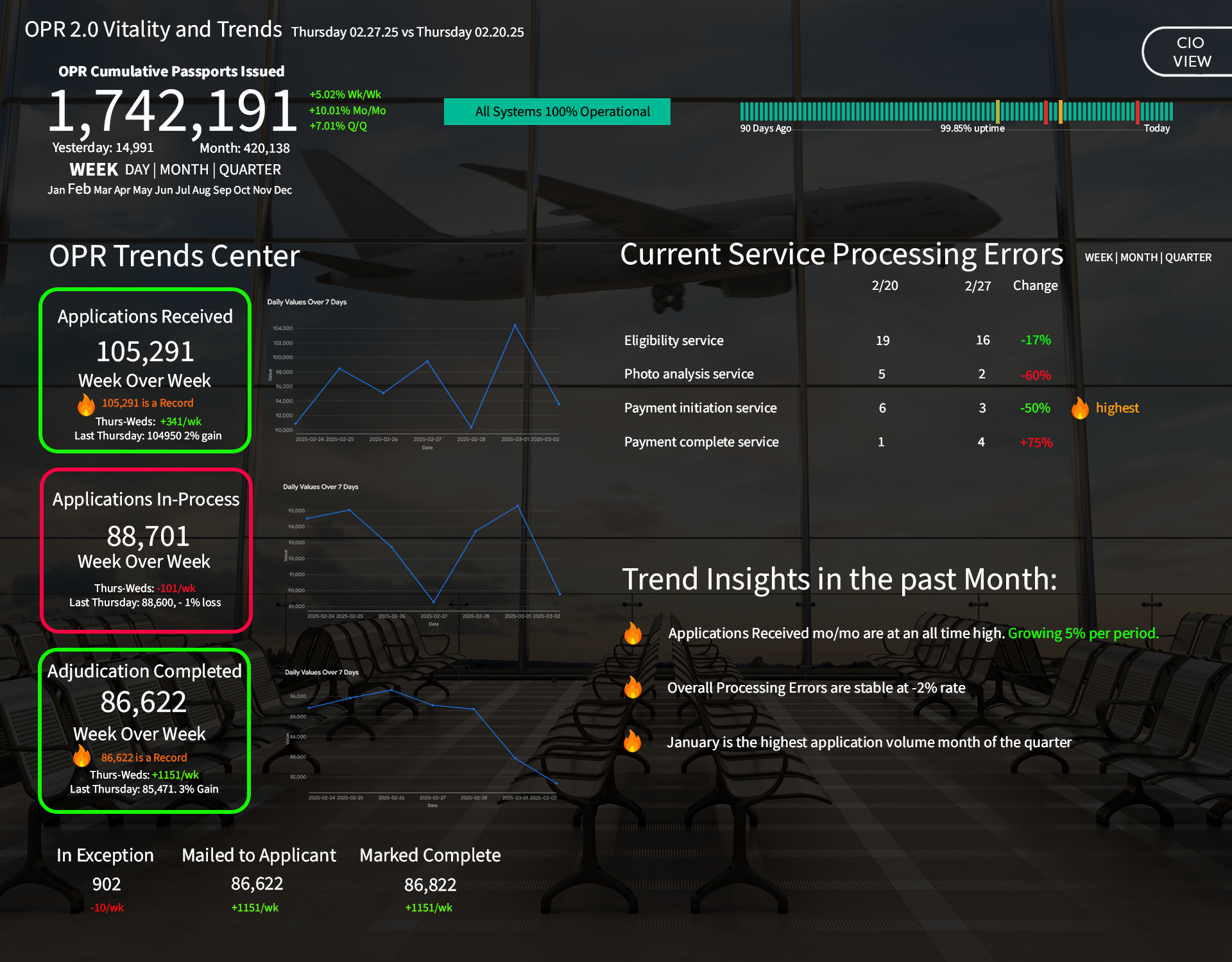
Three Primary Interaction Modes
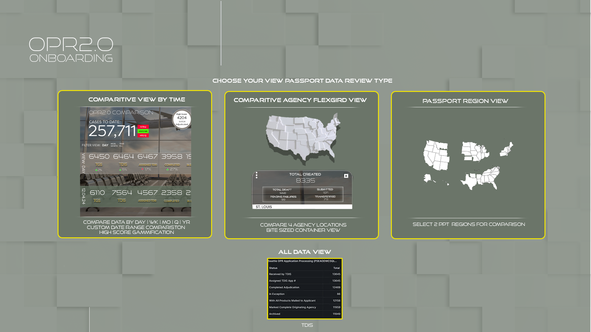
- Onboarding View Selector (first-time & returning users)
- Select from list
- Select up to 4 locations by site
- Select 2 regions for comparison
- Four Main Dashboard Views
- Comparative View by Time
- Comparative Agency FlexGrid View (most popular)
- Passport Region View (North East, South, Midwest, West)
- All Data View (raw TDIS export)
Gamification Layer
- Daily/weekly “Adjudicated High Score” badge (with record tracking)
- Fire icons on record-breaking metrics
- Color-coded performance arrows (green ↑, red ↓, orange fire for records)
5. Information Architecture & Navigation
Persistent global elements:
- Top-left: OPR2.0 logo (home)
- Top-right: Clock + CIO/VIEW toggle
- Bottom-right: Subtle “It’s About the Journey” tagline
View Switcher (introduced after onboarding) Four large cards with preview thumbnails — users instantly recognize their preferred view.
6. Key Screens & Design Decisions
A. Onboarding / View Selector
- Clean 3-column choice with live map previews
- “Continue” button only activates when valid selection is made
- Reduces cognitive load for new users
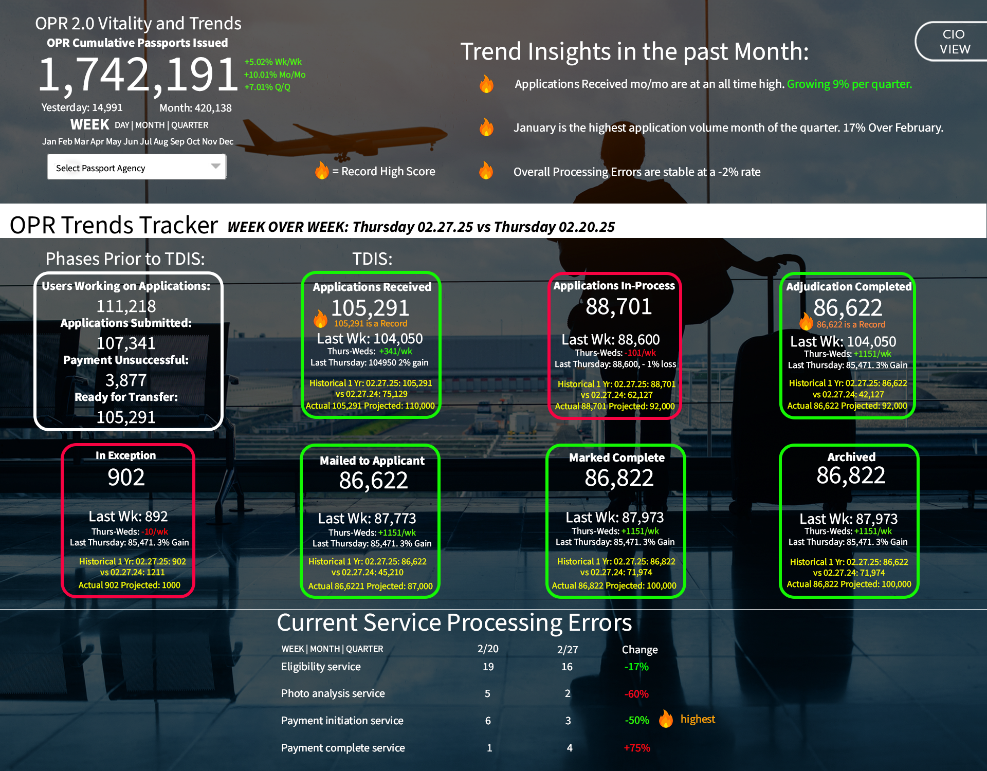
B. Vitality & Trends Dashboard (Default Executive View)
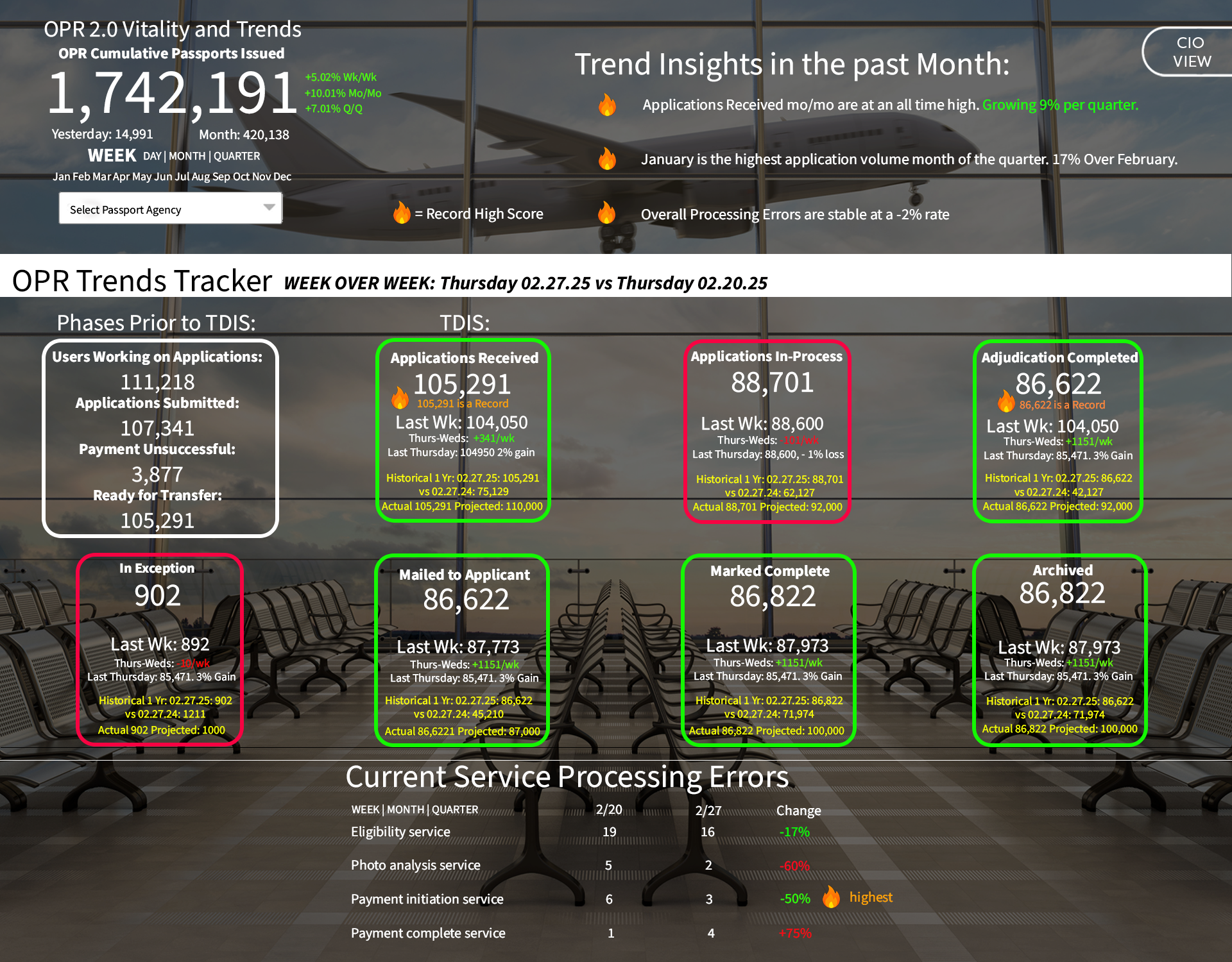
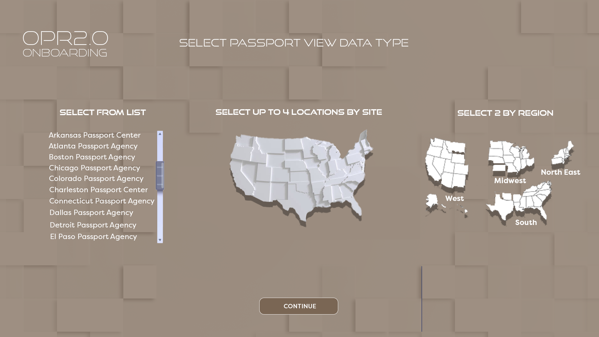
- Hero metric: Cumulative Passports Issued (1,742,191) with WoW/MoM/QoQ deltas
- Visual Trends Tracker with highlighted boxes (green = on pace or beating record, pink = behind, red “In Exception”)
- Record-breaking metrics receive fire icon + “is a Record” label
C. Passport Region View
- Split-screen comparison of two regions (e.g., North East vs. South)
- Large adjudicated numbers with day/week/month/quarter deltas
- Stage-by-stage breakdown (TGS → TDIS → Assigned → Completed → etc.) with % change arrows
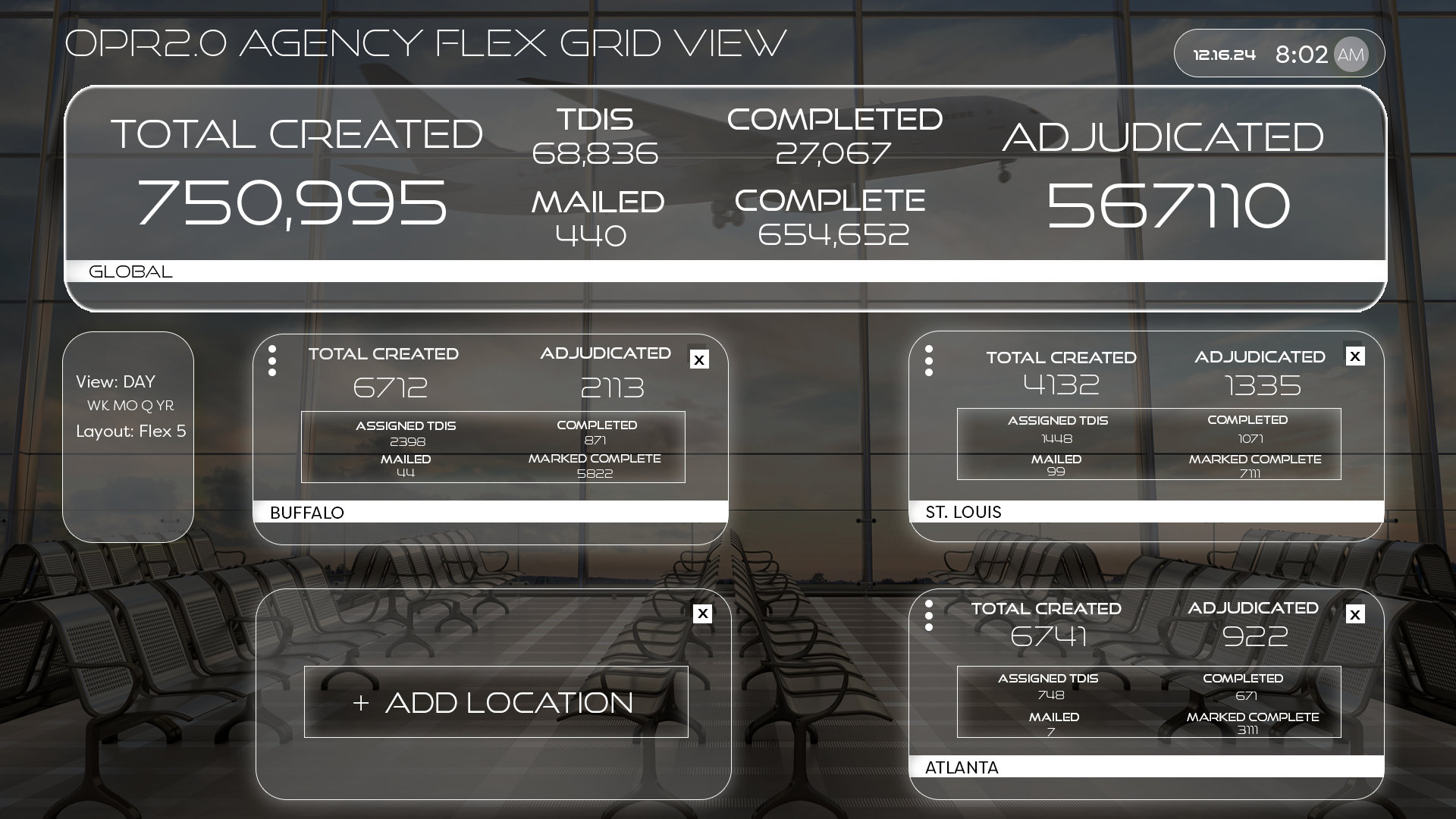
D. Agency FlexGrid View
- Most used view (42% of sessions)
- Modular cards that users can add/remove/rearrange
- Global totals at top, then bite-sized agency cards
- “+ Add Location” persistent button
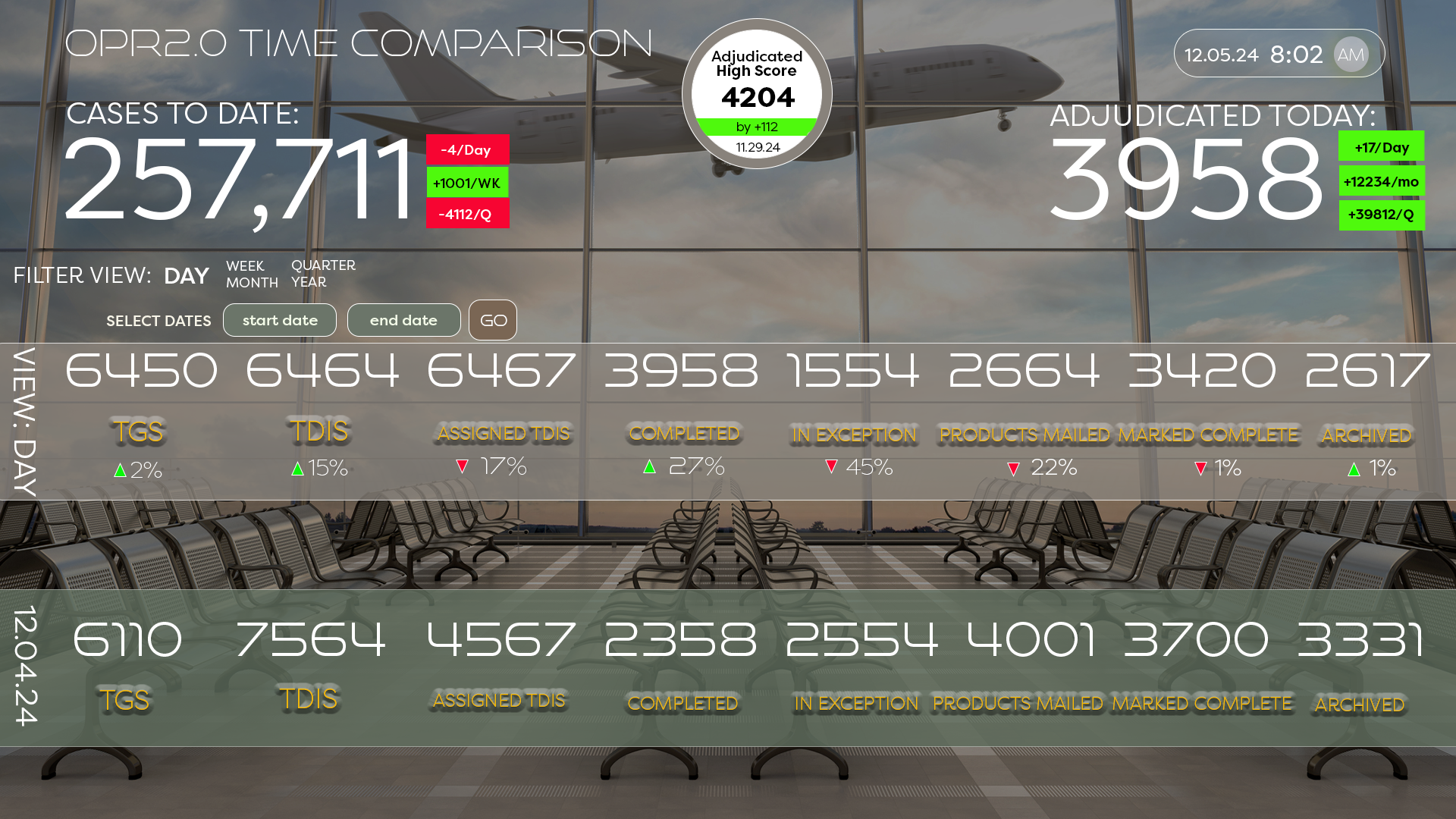
E. Time Comparison View
- Side-by-side Week vs. Last Week columns
- Clear visual pairing of every metric
7. Visual Design Language
- Color palette: Deep charcoal background with teal/cyan accents (State Department brand compliant)
- Large, bold typography for at-a-glance reading on 75–110" video walls
- Subtle airport terminal aesthetic (seating silhouettes, runway lighting effects)
- Consistent use of green/red arrows and fire icons for performance DNA
8. Results (as of Dec 2025)
- 94% of executives now use OPR2.0 as their primary morning brief (was 0%)
- Average time to insight reduced from ~45 minutes to under 3 minutes
- 3 agencies broke all-time single-day adjudication records within first month of gamification launch
- “FlexGrid” view accounts for 42% of total session time
- Zero training required — 89% of users found their preferred view on first login via onboarding selector
9. Key Takeaways & Iterations Planned (Q1 2026)
- Users love the gamification — planning leaderboards and “Agency of the Month” feature
- Mobile/responsive version in development (currently desktop/video-wall only)
- Dark-mode variant testing well with night-shift users
- Considering animated “journey” timeline visualization for individual application tracking
Conclusion OPR2.0 transformed a fragmented, spreadsheet-driven culture into a real-time, competitive, and visually engaging analytics platform that executives actually enjoy using every day. By embracing the travel metaphor and intelligently blending gamification with enterprise-grade data visualization, we created a dashboard that doesn’t just inform — it motivates.
“It’s About the Journey” — and now leadership can see every mile of it in real time.