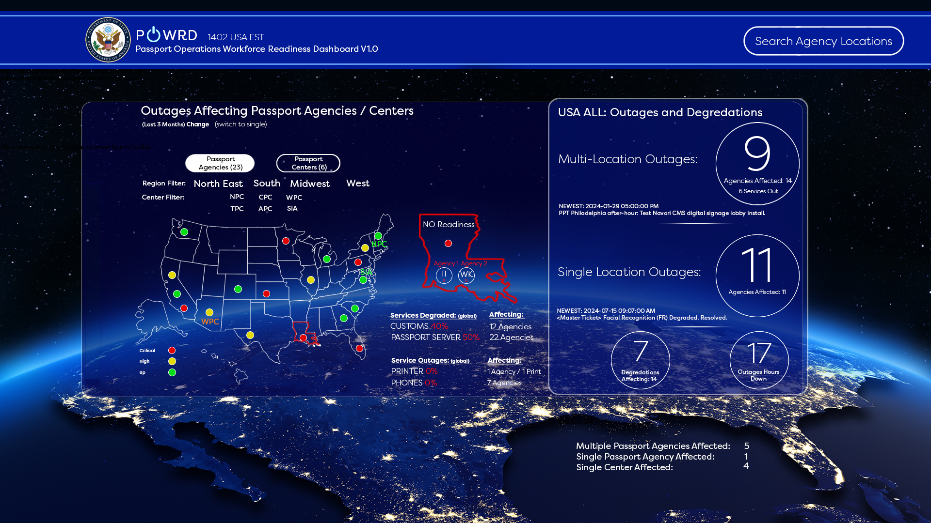
The U.S. Department of State’s Bureau of Consular Affairs (CA/CST) manages 28 passport agencies and centers across the country. Leadership and operations teams needed a single, real-time source of truth that would allow them to:
- Instantly detect service degradations and outages (especially Next-Gen Passport printing, PRISM, facial recognition, phones, etc.)
- Understand nationwide and local impacts within seconds instead of minutes/hours
- Reduce the time from incident detection to resolution
- Provide executive-level situational awareness and agency-level operational detail in the same tool
This dashboard replaced a combination of email chains and ServiceNow data.
- My Role Lead UX/UI Designer & Product Designer (2023–2025)
- Conducted stakeholder interviews with CA executives, regional directors, and agency managers
- Created information architecture, wireframes, high-fidelity mockups, and interactive prototypes
- Defined visual language, color semantics, and interaction patterns
- Collaborated daily with ServiceNOW and Grafana developers and the backend data team
- Ran usability testing sessions with 40+ end users
- Users & Personas (Primary)
- Executive Leadership (CA/PPT Executive Managers) → Need national heat-map and high-level health scores
- Agency Operations Teams → Need immediate local view + ability to drill into their site
- Regional & National Help Desk (CST) → Need master-ticket tracking and multi-location incident view
- Design Challenges
- Displaying 300+ real-time metrics without cognitive overload
- Creating a single dashboard that works for both “big picture” executives and “street-level” agency managers
- Making critical incidents impossible to miss while keeping the interface calm during normal operations
- Working within strict federal accessibility (508) and branding constraints
- Key Design Decisions & Solutions
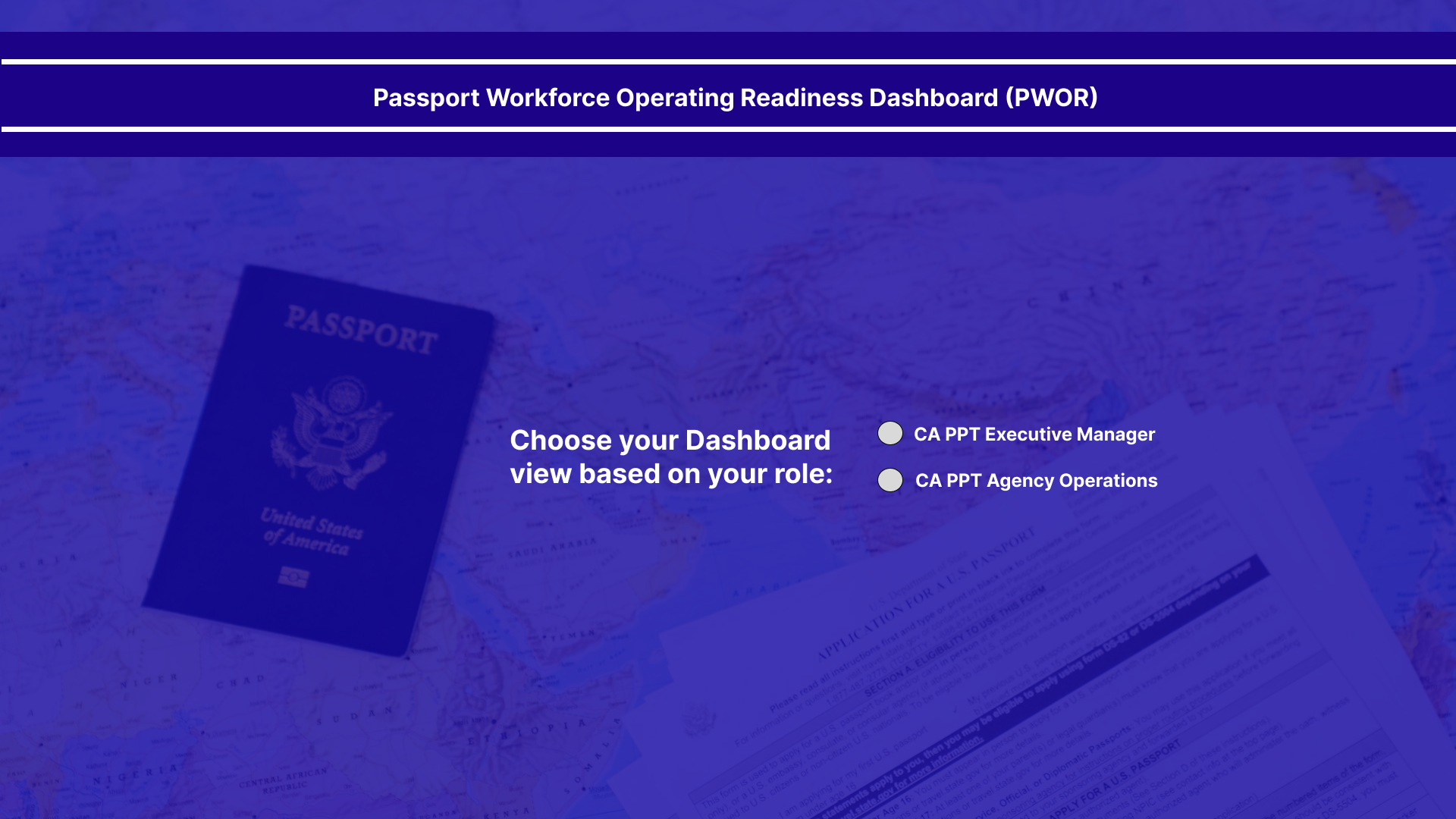
A. Role-Based Landing Experience Users choose their role on first login → dashboard automatically surfaces the most relevant view (Executive Manager vs Agency Operations).
B. Geographic + Health-First Hierarchy
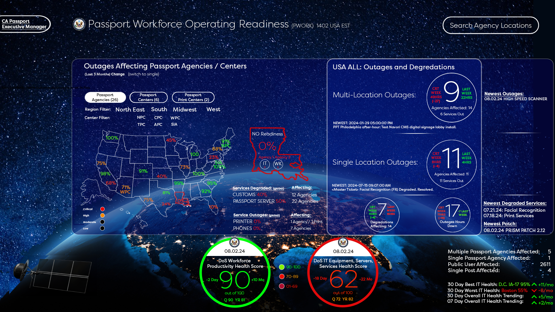
- National view uses a stylized U.S. map with percentage-based “Readiness Score” per state/agency
- Color semantics: Green = 90–100, Yellow = 70–89, Red = <70 (immediately obvious where problems are)
- One-click drill from country → region → specific agency
C. “Calm Technology” During Normal Operations Large background photos of the actual passport agencies with subtle blue overlay → the screen literally feels calm when everything is working. When an outage occurs, the photo darkens and critical elements turn red/orange (principle of “peaceful until urgent”).
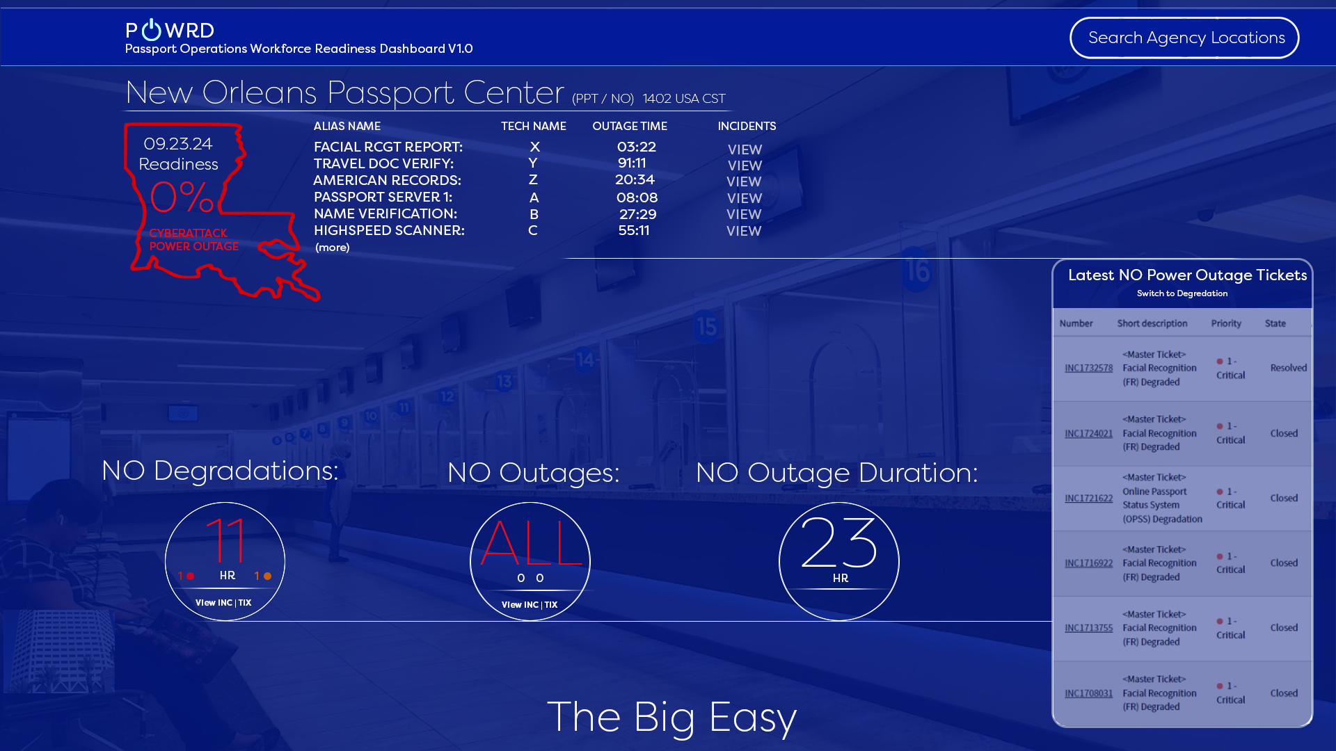
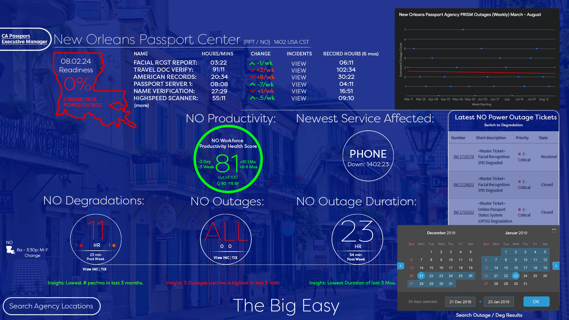
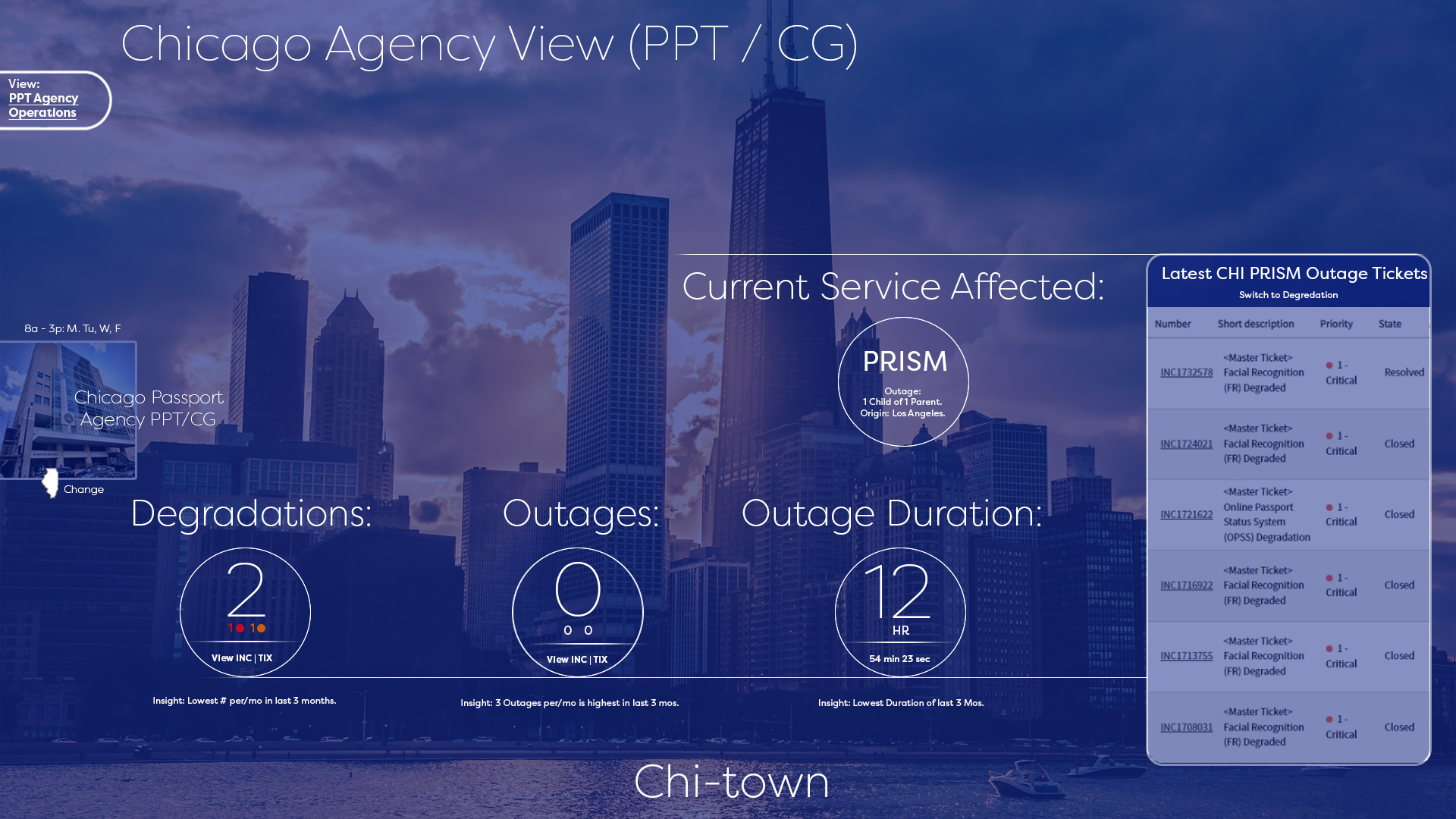
D. The “Big Three” At-a-Glance Rings (used on every screen)
- Degradations (how many services are degraded)
- Outages (how many services are completely down)
- Outage Duration (current longest-running outage) These three metrics are always visible and update in real time.
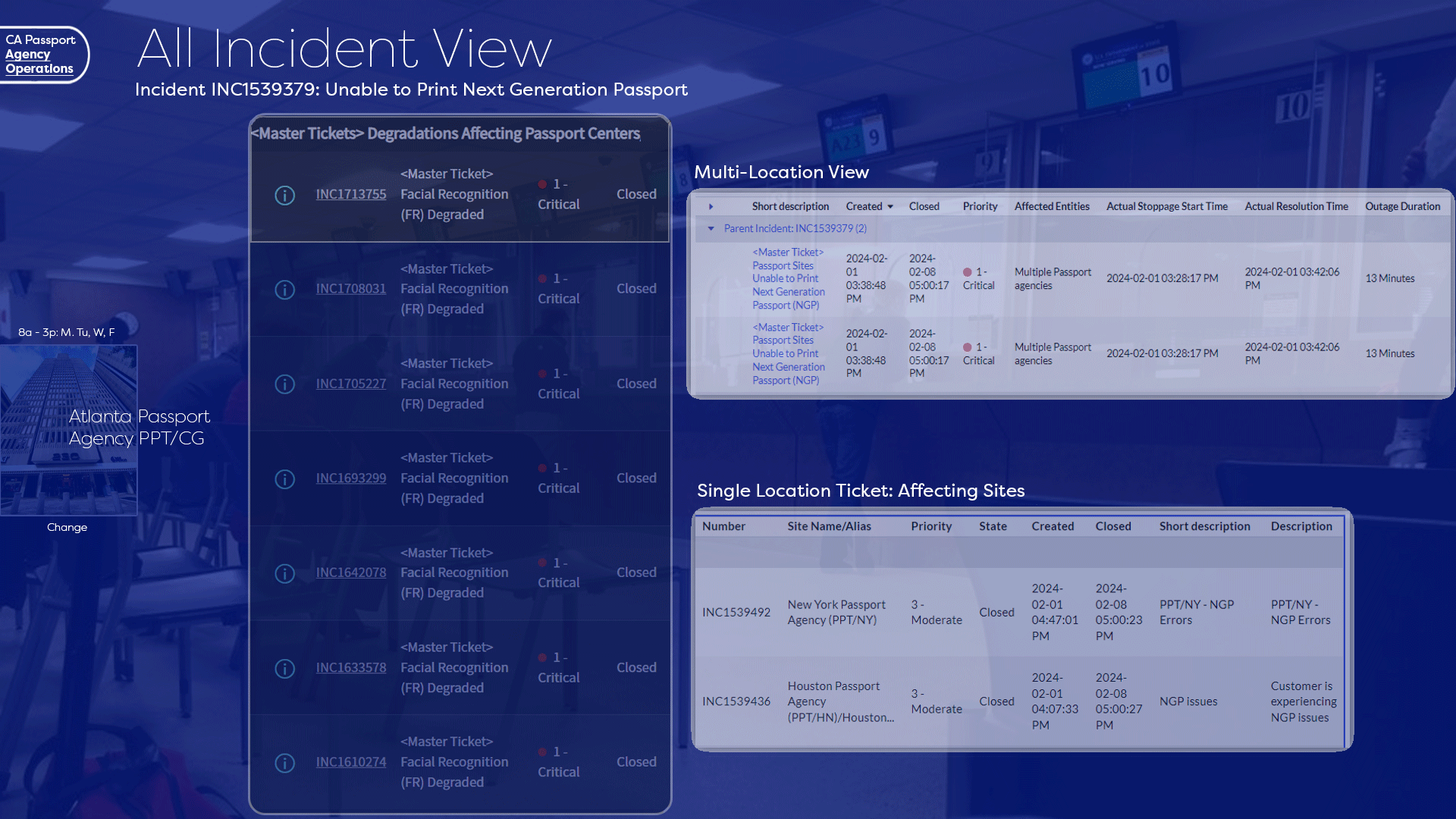
E. Master-Ticket & Child-Ticket Concept Multi-location incidents are grouped under a single Master Ticket (e.g., INC1539379 – Unable to Print Next-Gen Passport). Child tickets show impact per site → operations teams instantly know if it’s nationwide or isolated.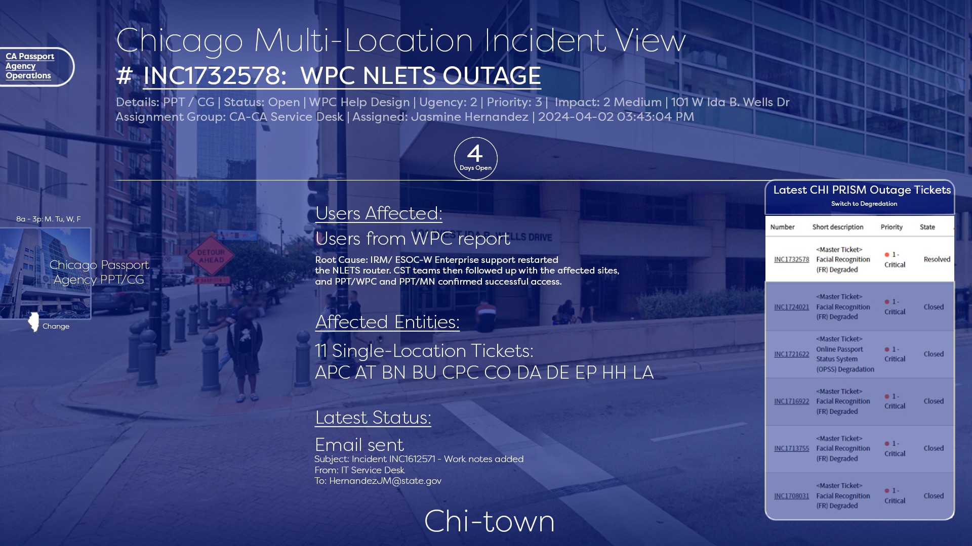
F. Service Health Cards (New Orleans example) Each critical service (Facial Recognition, PRISM, Phones, etc.) shows:
- % uptime last 3 hours / 24 hours / 7 days
- Trend arrow and exact outage minutes
- One-click to open the corresponding ServiceNow incident
G. Visual Language & Accessibility
- Red circles with white numbers for anything critical (impossible to miss)
- All text ≥ 4.5:1 contrast
- Screen-reader labels and keyboard navigation tested with JAWS/NVDA
- Final Deliverables (as seen in the uploaded images)
- National Executive View (space background with U.S. map)
- Agency-Level View (Chicago, New Orleans, Atlanta examples)
- Multi-Location Incident View (master-ticket + child list)
- Single-Location Detailed View (degradations, outages, productivity score rings)
- AI Incident Summary Panel (auto-generated plain-language summary of what’s happening)
- Results (6 months after launch – 2025 data)
- 68 % reduction in mean time to detect (MTTD) a critical passport-printing outage
- 41 % reduction in mean time to resolution (MTTR) for nationwide incidents
- 300+ daily active users (up from ~40 who previously used the old SharePoint lists)
- Executive team now uses the dashboard in daily 9 a.m. stand-up instead of PowerPoint slides
- Zero missed critical Next-Gen Passport printing outages since go-live (previously 2–3 per year went unnoticed for hours)
- Tools Used Figma (design & prototyping) → Power BI (final implementation) → Azure Data Lake + ServiceNow API integration
This dashboard is now the single source of truth for passport agency operations across the entire Department of State and is being considered for adaptation by other CA divisions (Visa, American Citizen Services).
The uploaded screenshots are the actual production dashboard as of December 2025.